
 This post is a text version of this YouTube video:
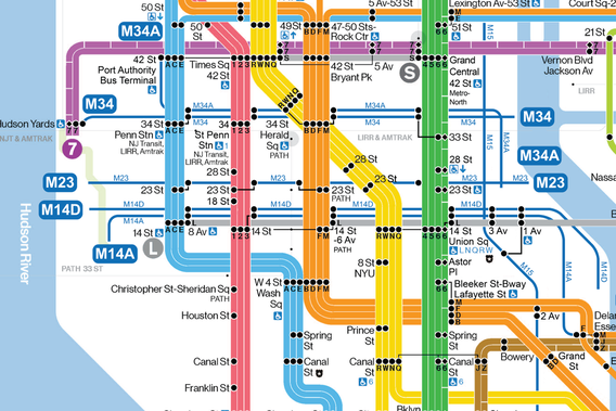
https://youtu.be/P1GsBU8BAL4 New York's subway system is quite easy to conceptualize, even if its intricacies are confusing at times. Signs in stations direct commuters towards their desired trains, which travel all around the city. The simplicity of this concept at its core is, in no small part, a consequence of having a clear, well designed map to navigate the system. Personally, I have a preference for the new Vignelli-style maps that the MTA has been producing, because it gives much better clarity of lines and their relationships between each other. It's also just a very clean, aesthetically pleasing design. Compare this to NYC's bus map, and the difference is immensely striking. Since the bus system utilizes the street grid as its foundation, the map becomes very convoluted and hard to decipher. Despite the city's best attempts, I don't think there's any good way around this, because the sheer number of routes and their complexity prevent any map from reading as clearly as that of the subway system.
0 Comments
|