
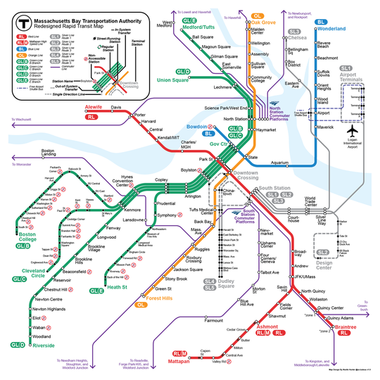
On a recent trip to Boston, I became quite annoyed at the official transit map. So naturally, I decided to make a better version! This design builds off the representational choices and qualities present in the existing map, and it adds some key elements that I feel, every good transit map needs:
1. A Separate Line for Each Service The amount of times I've seen official maps that consolidate services into one ambiguous line is quite infuriating. While a simple, albeit lazy, method of saving valuable space on the page, this tactic adds a layer of ambiguity to the system, and most transit systems are confusing enough without that illustrative choice. Having one distinct line for each service makes it clear exactly where each line goes and to which lines you can transfer. However, this rule doesn't apply to regional rail lines or other additional information that the map isn't intended to communicate fully. This design is intended to be solely for representing the rapid transit services of Boston, and regional rail, while helpful, doesn't fit this main purpose. 2. Clear Hierarchy of Services Many in Boston complain about the fact that the Silver Line, Boston's own approach at Bus Rapid Transit, doesn't offer the same level of service as the rail routes. This is the same situation with regional rail lines, which is why they're represented with a smaller thickness. However, one interesting thing that the current map completely neglects is the differences in each Green Line route. As the only light rail service in Boston, the Green Line holds a unique place, with some sections in a street-running median and others in a fully grade separated tunnel. In this map design, I chose to represent the street-running portions with slightly smaller text and dark station dots. Such a simple touch allows riders to instinctively tell what type of service each line offers, although admittedly, I'm not sure everyone will necessarily notice it. Regardless, it's an important distinction that serves those who are looking for such information. 3. Lack of Superfluous Details A lot of transit agencies like to add certain elements to their transit diagrams that, frankly, don't really need to be there. In this design, I only included additional information where it's absolutely necessary, like with the Amtrak Logo at the North and South Stations. One final note on this map is that I tried to add some level of geographically accurate placement, as many fan redesigns also include this aspect. I always try to prioritize this the least because the most important factor in a transit diagram is to communicate the system effectively. Oftentimes, geographic specifics make this confusing. However, I think I was able to achieve a fairly good balance between the two. Thanks so much for reading to the end! Be sure to share this with all your Boston friends to encourage everyone to take public transit when they can :) I
0 Comments
Your comment will be posted after it is approved.
Leave a Reply. |
|||